Table of contents
- Clear and Logical Structure
- Typography Guidelines
- Responsive Design
- Designing with Color in Mind: A Key Focus Area
- Consistent Navigation
- Consistency in UI Components
- Non-Motion-based Solutions
- Focus Indication
- Optimal Touch Target Size and Spacing
- Open Links in New Window
- Creating Links with Purpose
- Animations and Flashing Content
Continuing with the next part of this series, we'll learn more about designing accessible web pages. It is crucial to prioritize accessibility in our designs.
On our path to achieving the double A, we sometimes encounter issues during development, which are actually problems that stem from earlier, from the design phase.
Here I'm going to explain the most important aspects, a designer must know and fulfil when making accessible designs.
Clear and Logical Structure
A logical structure helps users with screen readers or assistive technologies understand and navigate the content easily.
Ensure your page titles are descriptive and informative. Use informative headings and labels for forms and interactive controls. This is particularly beneficial for users with limited short-term memory, low vision, or difficulty reading text. These users may only see a few words at a time, so clear headings and labels help them understand the purpose of each section effectively.
Also, generate content that possesses the ability to be showcased in various formats, such as a simplified layout, while retaining both its information and structure.
Very important, ensure clarity in all your writing, not only headings.

Typography Guidelines
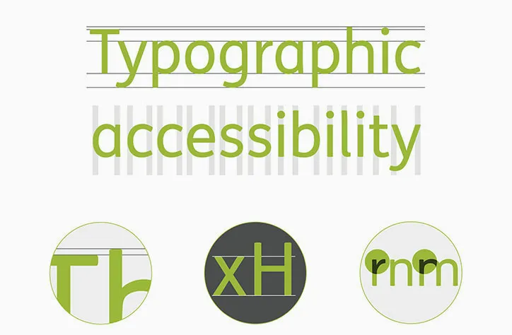
Leave a space following paragraphs that is at least 2 times the font size.
Line height (line spacing) should be a minimum of 1.5 times the font size.
Maintain word spacing of at least 0.16 times the font size.
Set letter spacing (tracking) to a minimum of 0.12 times the font size.
Avoid using font sizes smaller than 10 points.
Responsive Design
This is very obvious, but create a responsive design that adapts to different screen sizes and devices. It ensures that users can access and navigate the website seamlessly on desktops, tablets, and mobile devices.
I prefer developing using mobile-first approach.

Designing with Color in Mind: A Key Focus Area
While color is undoubtedly important in web design, it is crucial to ensure that it does not create barriers for individuals with visual impairments.
Color Contrast
Ensure sufficient contrast between text and background colors to make content readable. Consider users with visual impairments and use color contrast checkers to verify that your color combinations meet accessibility standards.
Ensure that text maintains a color contrast ratio of at least 4.5:1 with its background.
Icons and graphical objects should have a contrast ratio of at least 3:1 when compared to adjacent color(s).
Large-scale text should have a contrast ratio of at least 3:1.
If the text is integrated within a logo or brand name, there is no minimum contrast requirement.

Alternative indicators
Avoid relying solely on color to convey information. Provide additional indicators such as icons, labels, or patterns to ensure that users with color vision deficiencies can still understand and interact with the content.

Error messages
If color is used to indicate status, error messages, or alerts, ensure that there is also a non-color element or text-based explanation accompanying it. This ensures that users who cannot perceive color differences can still comprehend the information being conveyed.

Designing in greyscale
One effective technique in achieving accessibility is designing in greyscale, where colors are removed and the website is presented in shades of grey.
This approach ensures that the website's content and visual elements can still be perceived and understood by individuals with visual impairments or color vision deficiencies. Designing in greyscale allows for a focus on contrast, typography, and clear visual hierarchy, enabling an accessible and user-friendly experience for a wider range of users.

Use color simulation tools to experience how your website appears to individuals with different types of color vision deficiencies. These tools can help identify potential issues and allow for necessary adjustments to improve accessibility.
Consistent Navigation
Maintain a consistent and predictable navigation structure throughout the website. Clear labels, logical menus, and breadcrumb trails make it easier for users to locate and access different sections of the website.

Consistency in UI Components
It is important to ensure that components with similar functionality maintain consistency throughout the website or application. Establishing a design system, pattern library, or style guide is highly recommended to emphasize and maintain consistency within the team.
This enhances usability, reduces cognitive load, and establishes a cohesive visual identity for the brand.
Additionally, a design system or style guide streamlines the development process, promotes collaboration, and facilitates efficient teamwork.
We use storybook in our development cycle.

Non-Motion-based Solutions
If you rely on device motion to activate a specific feature, it is essential to offer an alternative user interface for accessing that feature. Alternatively, allow users to disable the motion activation of the feature altogether.
Focus Indication
Provide clear visual cues to indicate the focus state of interactive elements, such as links, buttons, and form fields.

Optimal Touch Target Size and Spacing
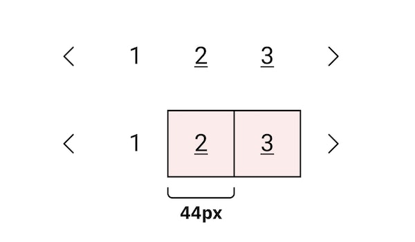
In web accessibility, it is recommended that the size of pointer targets for interactive elements be at least 44x44 pixels, ensuring easy and accurate interaction. However, there are a few exceptions:
Equivalent: If the target can be accessed through an equivalent link or control on the same page, which is also at least 44x44 pixels, the size requirement can be met by the alternative element.
Inline: If the target is embedded within a sentence or a block of text, the size requirement may be adjusted to fit within the context, considering the surrounding content.
Open Links in New Window
Opening links in new windows can be disorienting for users, especially those who rely on screen readers or have cognitive disabilities. It can disrupt their browsing experience and make it challenging to navigate back to the original page.
Instead, it is best to allow users to control how they open links by providing clear and descriptive link text, and letting them decide whether to open links in the same window or a new tab.

Creating Links with Purpose
Use descriptive and meaningful links instead of generic phrases like 'Click here' or content-free text such as 'More details' when applying them to a list of links.
Animations and Flashing Content
Avoid using excessive or intense animations, especially those with high contrast, rapid movement, or frequent flashing. If animations are necessary, provide users with options to control or pause them, allowing individuals to navigate and consume content at their own pace.
Additionally, ensure that any essential information presented in animations or flashing content is also available through non-animated means, such as descriptive text or alternative formats. This guarantees that users who cannot perceive or may be affected by the animations can still access and understand the information.
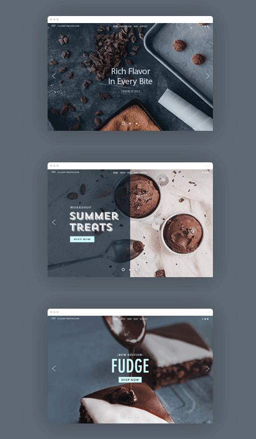
Furthermore, provide the option for users to pause, stop, or hide any moving, blinking, scrolling, or automatically updating elements within the content, such as dynamically-updating news tickers or chat messages.
Remember, designing an accessible website is an ongoing process that requires continuous evaluation and improvement. By considering these items, you can ensure that your websites are inclusive, user-friendly, and accessible to a diverse range of users.
If we approach web accessibility from the beginning, developers, and most importantly, end users, will experience gratitude and satisfaction.
I hope you have learned something new. If you think this might help other people, please hit the like button so that others can read it. ❤️
If you have any thoughts or questions, feel free to leave a comment!


